Landing page · WordPress
Landing page for a neuropsychology practice
Agnes is a neuropsychologist with a warm way of writing, which is rare in such a technical field. She needed a page that explained the assessment to worried families without losing that voice.
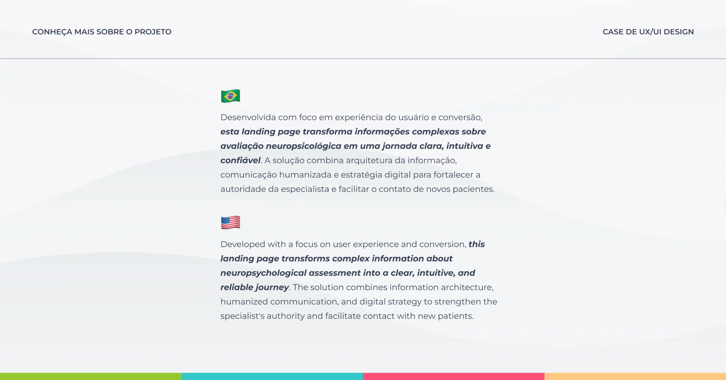
The people arriving are worried, not shopping for a service.
Most people who land on this page are a worried parent, or an adult who already suspects a diagnosis. The question on their mind is simple: does what I am going through have a name?
Many pages in this field read like scientific papers. The content is right, but it is hard to follow when you are anxious. Agnes didn't want to sound like that, and her own writing already showed it.
I organised the page around families' questions.
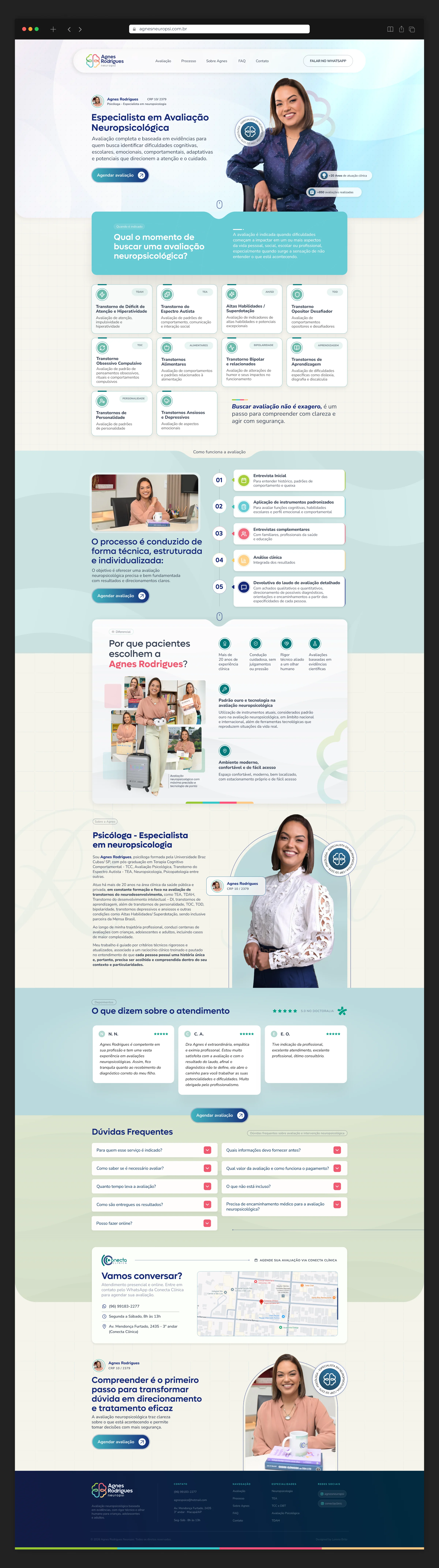
Instead of opening with a list of services, the page follows the order of the questions people have: what the assessment is, who it is for, when to seek it and how it works.
The conditions she works with and the five steps of the assessment became short blocks, easy to scan on a phone, so each person quickly finds the part that speaks to them.
I kept the texts Agnes wrote herself. Her voice is what reassures readers, and swapping it for pushier copy would have erased exactly what makes her different.
Booking follows the reader down the page, so a family can book the moment they feel ready.
Agnes now has a page that explains her work for her.
Agnes now has a link that answers families’ first questions in her own words, before they even get in touch.
For visitors, the assessment stops feeling distant and technical. They understand what it is, whether it fits their situation and how to take the first step.
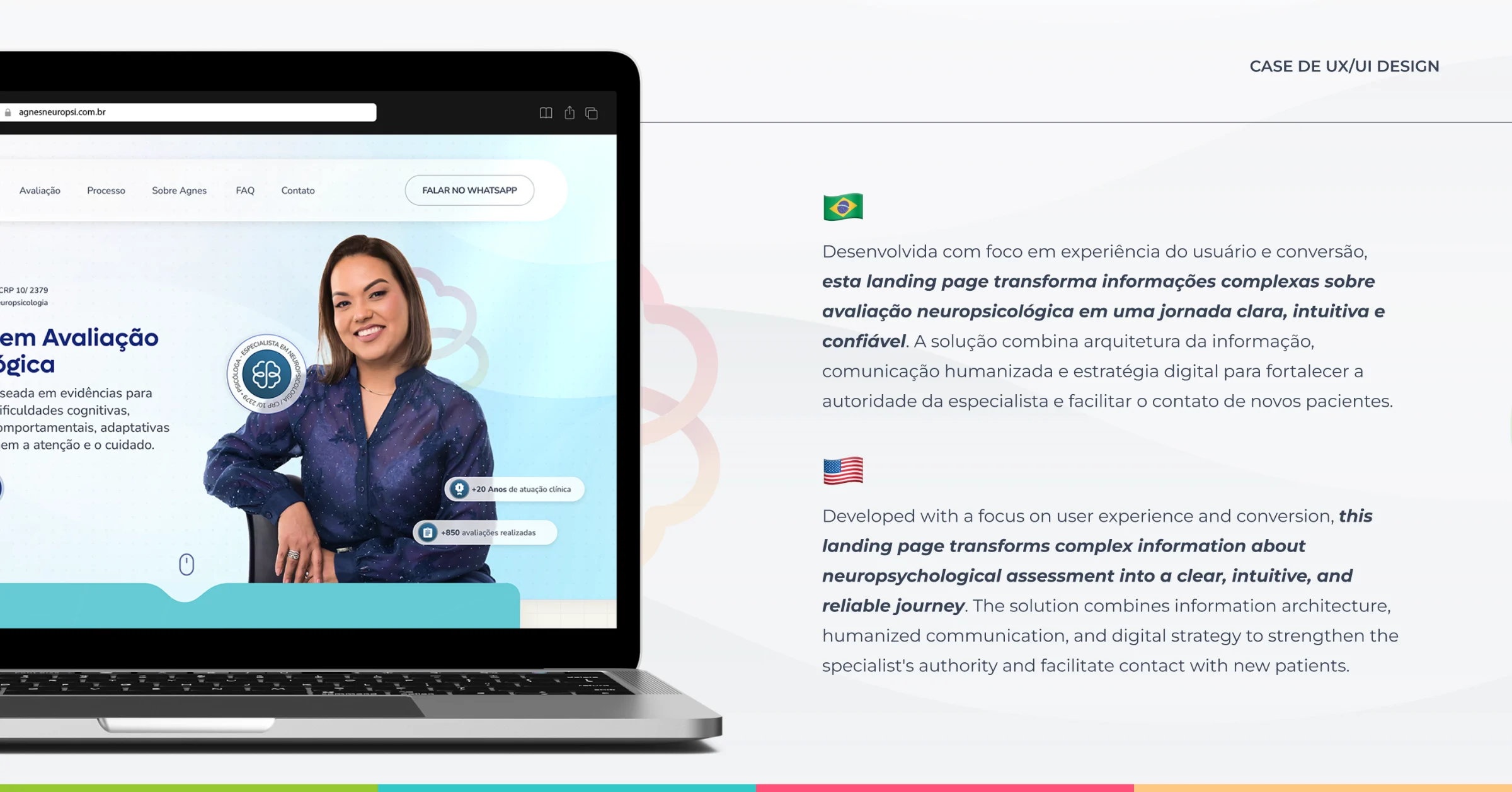
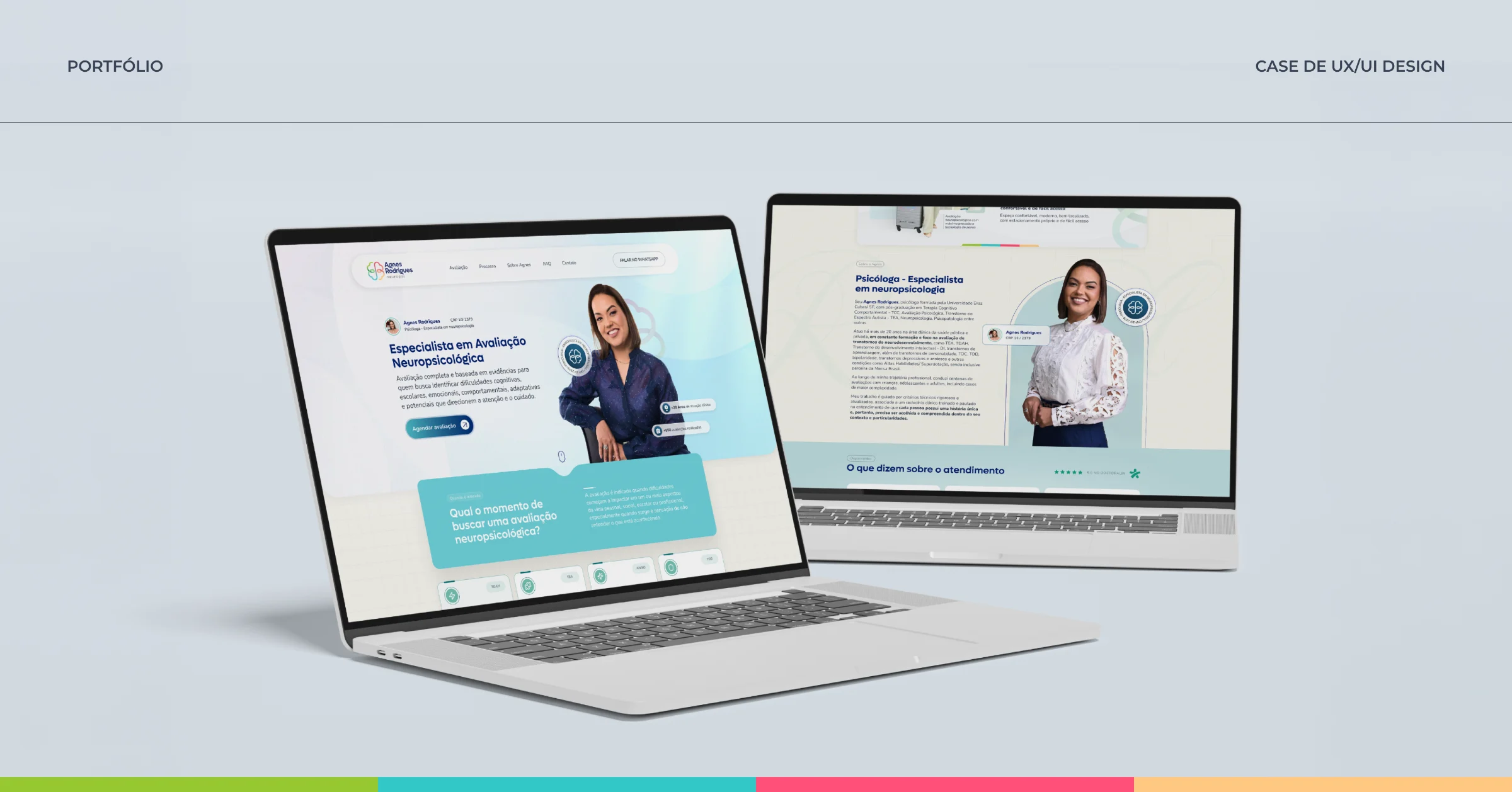
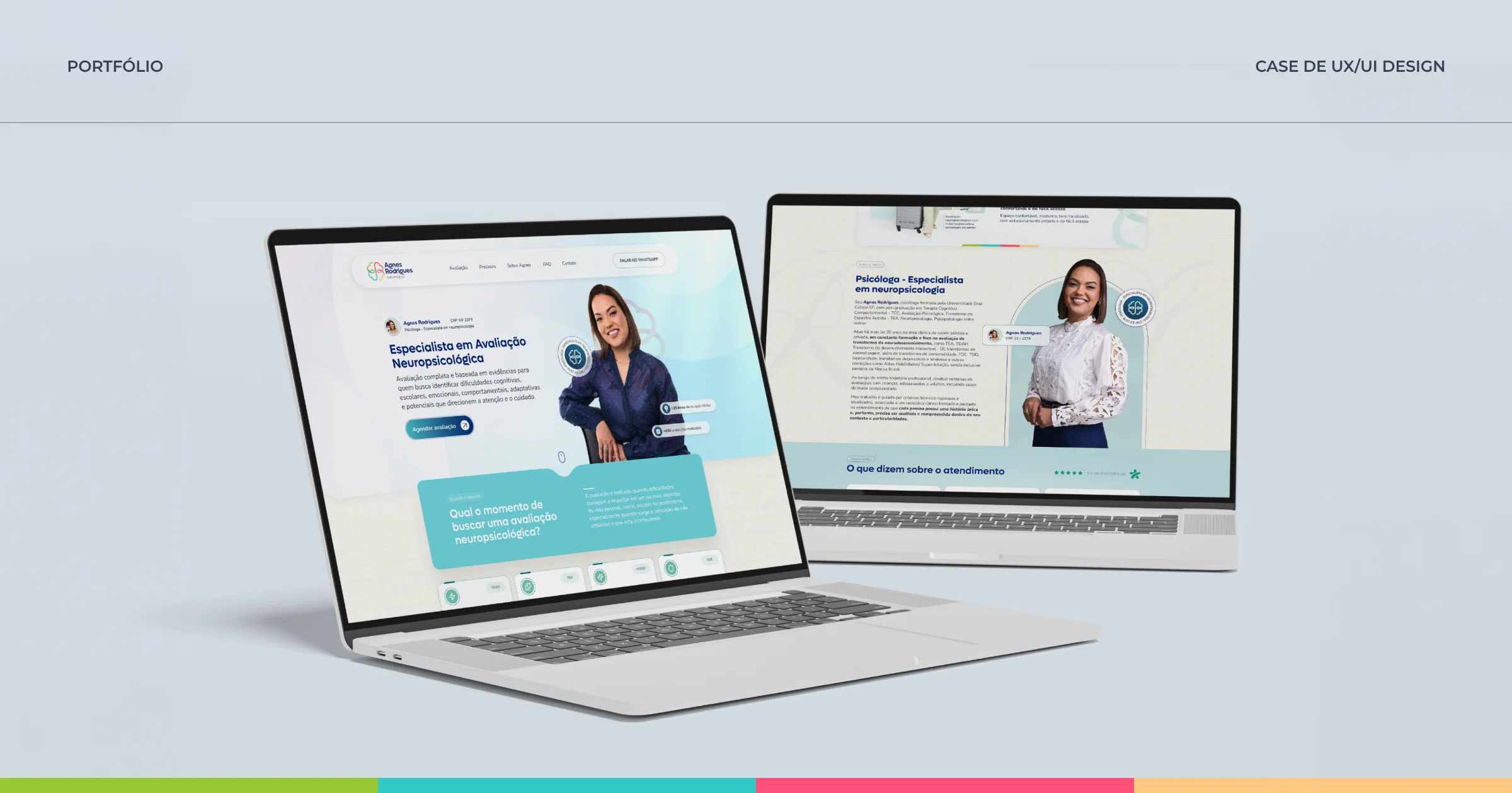
The page is live at agnesneuropsi.com.br. I designed it in Figma and built it in WordPress, mobile first.
Project screens
Want a project like this for your business?
Tell me what's going on in your business. I start by listening, and we'll find the best way forward together.
Let's talkMore projects
Landing page for an affordable dental clinic
For people who feel nervous about the dentist, the page explains the first visit before asking them to book.
Landing page · UI/UXLanding page for a paediatric cardiologist
For parents worried about their child's heart: plain language and booking always within reach.
Sales page · UI/UXSales page for a medical dermatology course
A course for doctors, presented with the seriousness and clarity this audience expects.