Home / Work / Sementes da Amazônia
Visual identity · Brand
Visual identity for a natural products brand
Sementes da Amazônia sells natural products made from forest raw materials. The brand had to be memorable and tell that origin story without needing an explanation.
Natural products tend to look like all the others.
Natural product brands repeat the same green leaves and the same beige. On the shelf and on social media, one looks like the next.
Sementes da Amazônia needed a brand of its own, easy to remember and tied to where its products come from.
A symbol that already tells the origin.
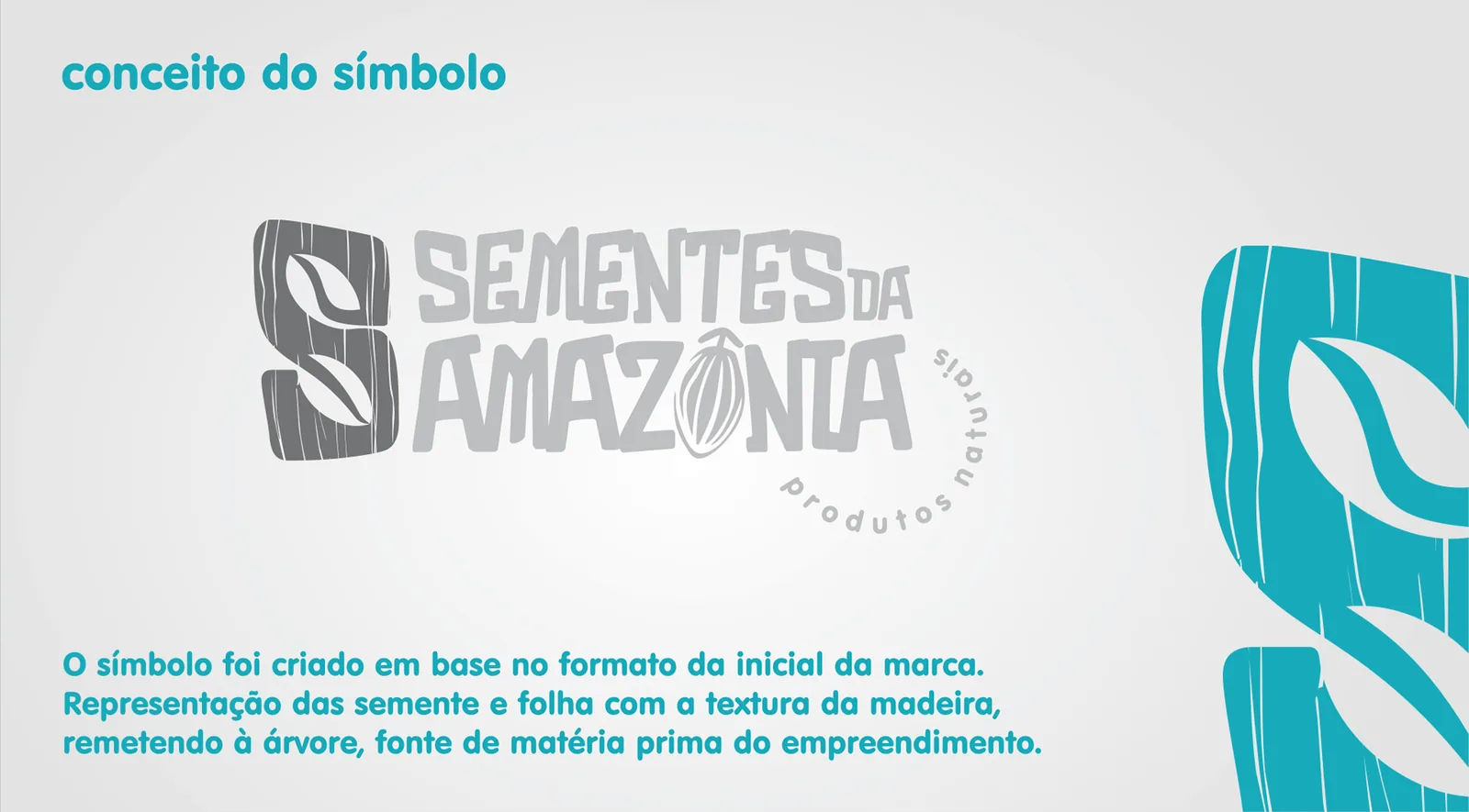
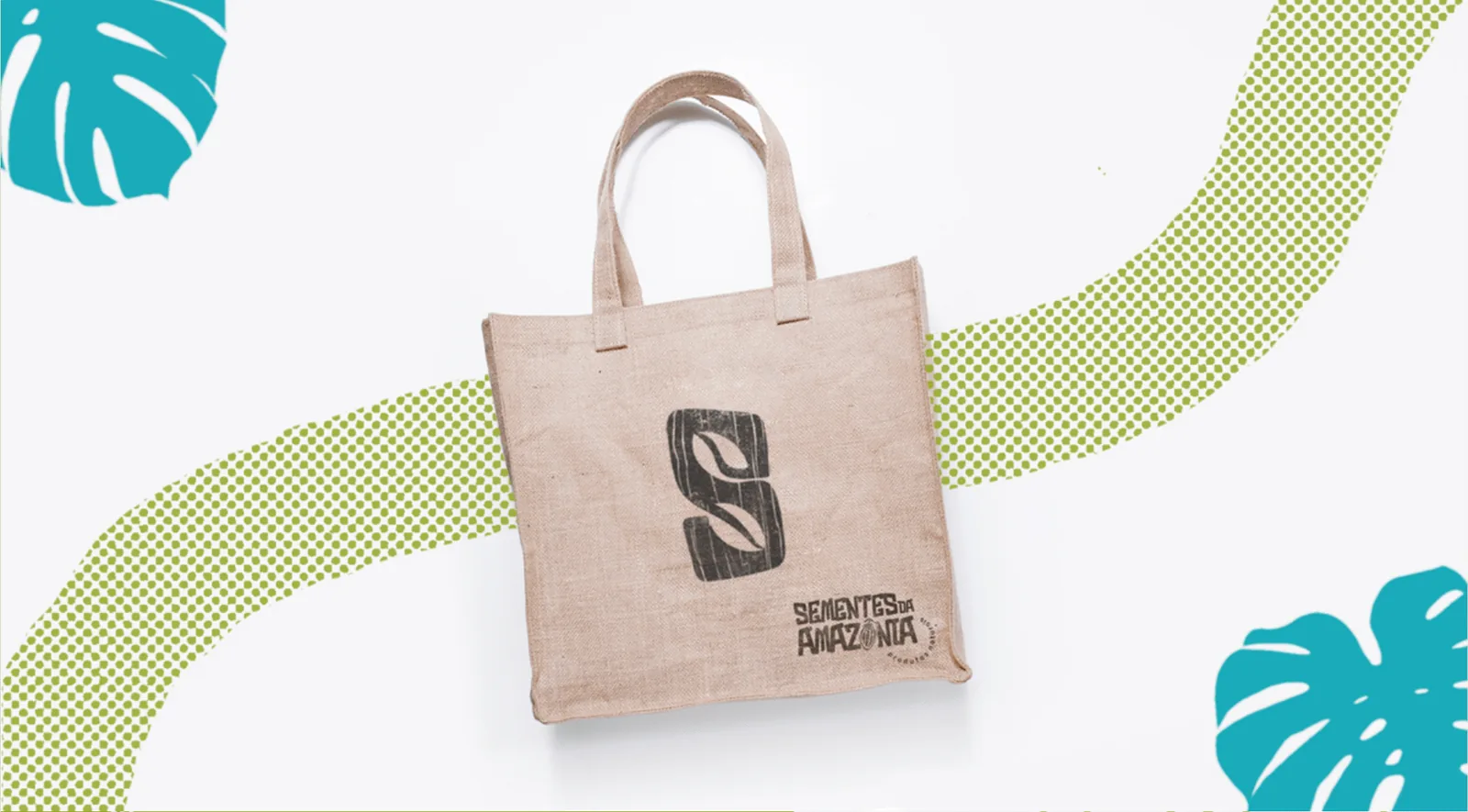
The symbol starts from the initial S and draws the seed and the leaf inside it, with a wood texture that recalls the tree the raw material comes from.
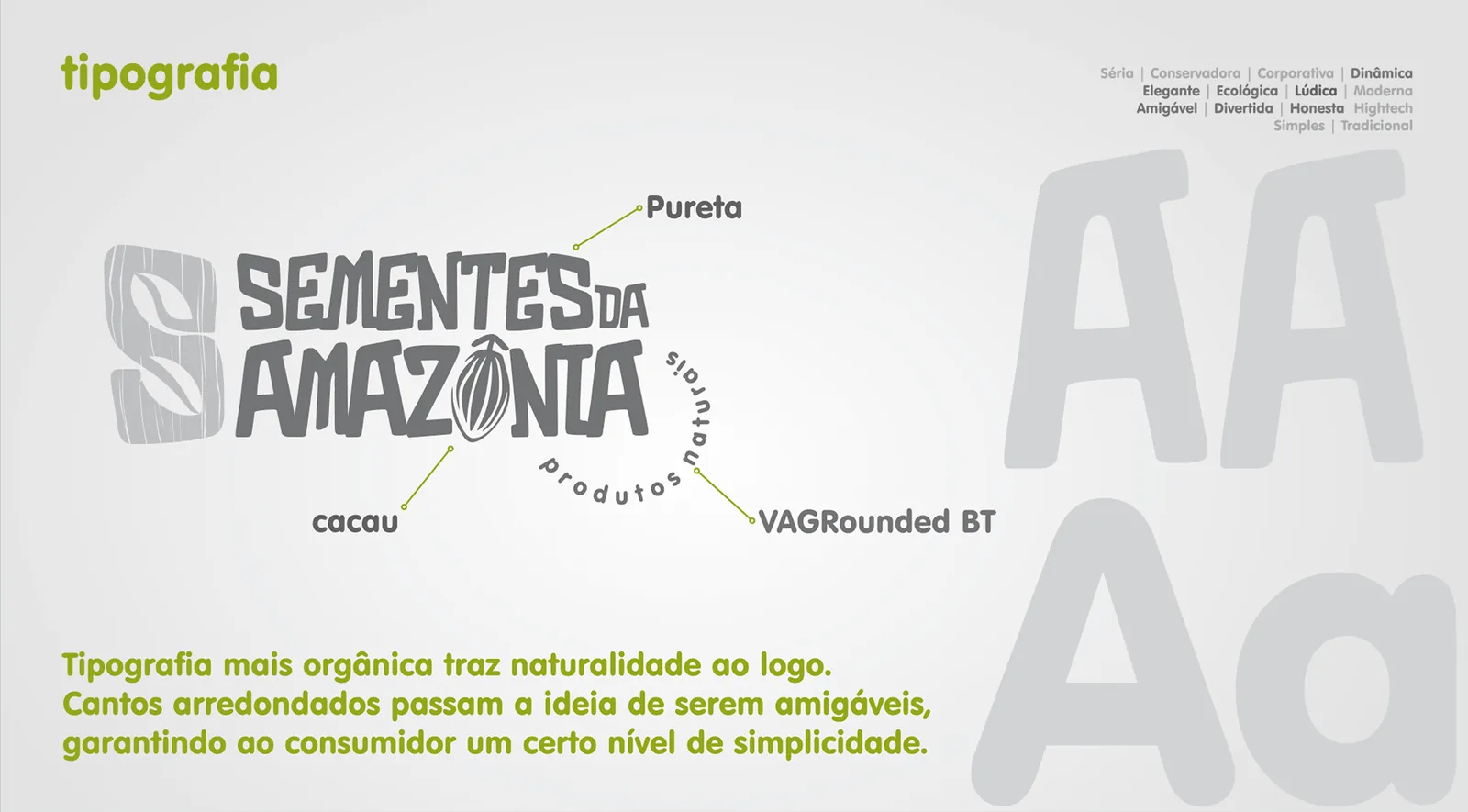
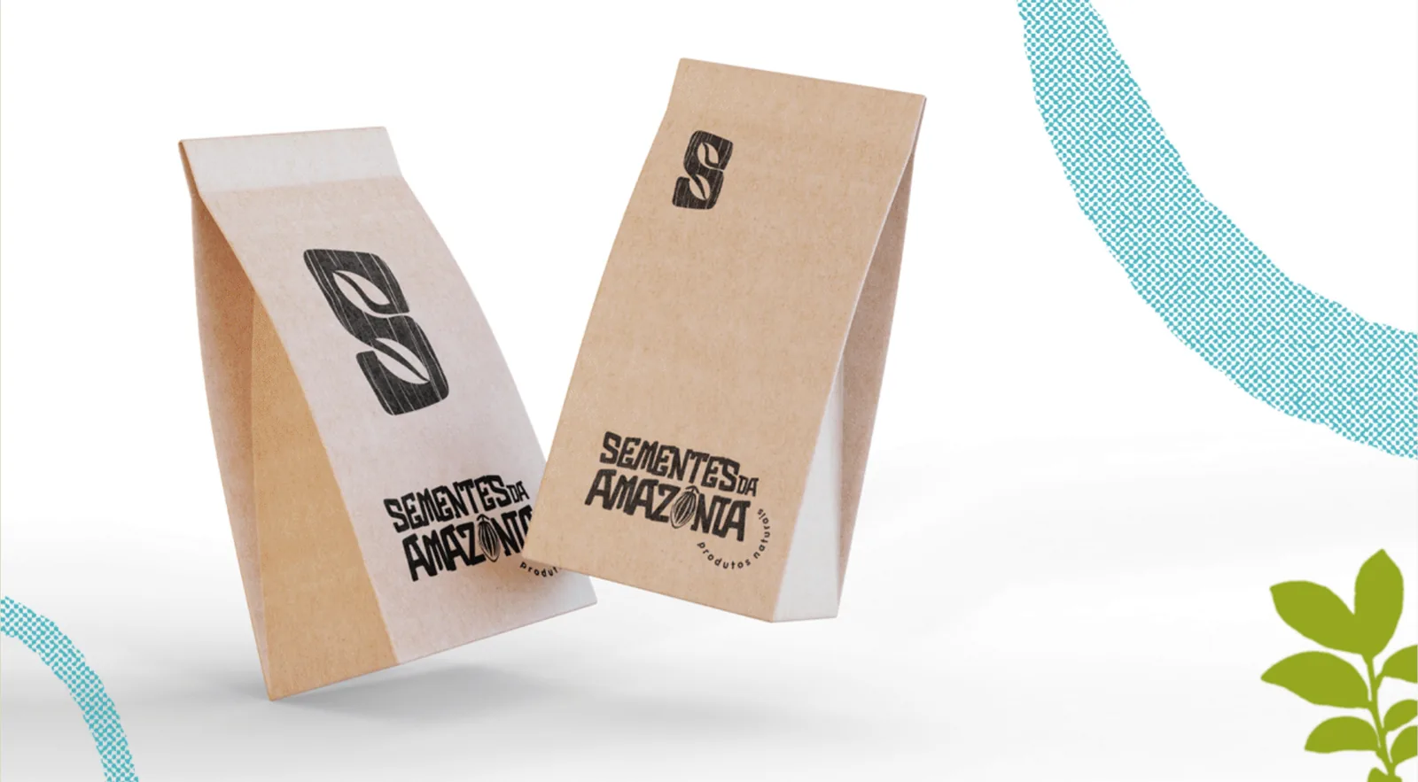
The type is organic with rounded corners, so the brand feels friendly and simple. The O in Amazônia became a cocoa pod.
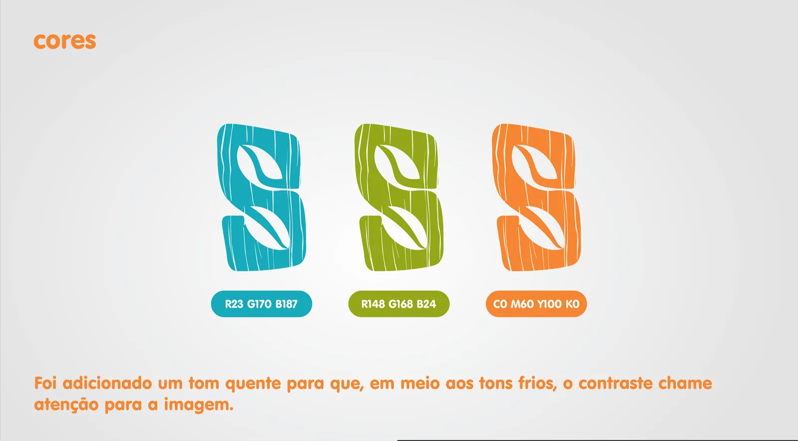
Turquoise and green are the base. Orange comes in as a warm tone that stands out among the cool ones.
A brand that works from the label to the T-shirt.
Sementes da Amazônia now has a brand of its own, easy to remember and tied to where its products come from. The S alone identifies the brand in small spaces, like the side of a package.
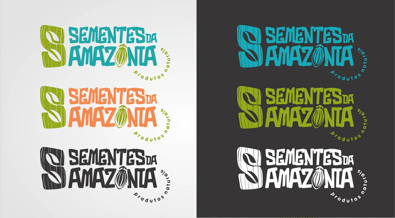
I delivered the symbol, logotype, light and dark versions, palette, typography and applications on packaging, tote bags, T-shirts and badges.
Project screens
Want a project like this for your business?
Tell me what's going on in your business. I start by listening, and we'll find the best way forward together.
Let's talkMore projects
Landing page for a neuropsychology practice
A neuropsychological assessment explained in the words families use every day.
Landing page · UI/UXLanding page for an affordable dental clinic
For people who feel nervous about the dentist, the page explains the first visit before asking them to book.
Landing page · UI/UXLanding page for a paediatric cardiologist
For parents worried about their child's heart: plain language and booking always within reach.