Brand identity · Guidelines
Brand identity and visual system for X-Lab
X-Lab needed a brand that would stay consistent after handover, in other people’s hands.

A brand that had to work without me around.
The identity would be applied by other people, on pieces I would never see.
Without clear rules, every new piece reinterprets the logo in its own way, and over time the brand starts to look like several different companies.
A system, not just a logo.
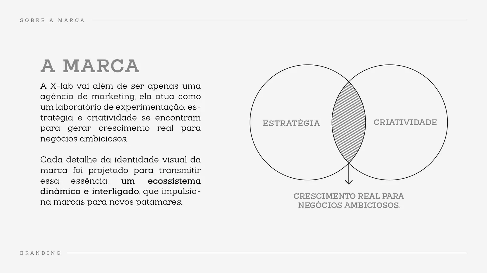
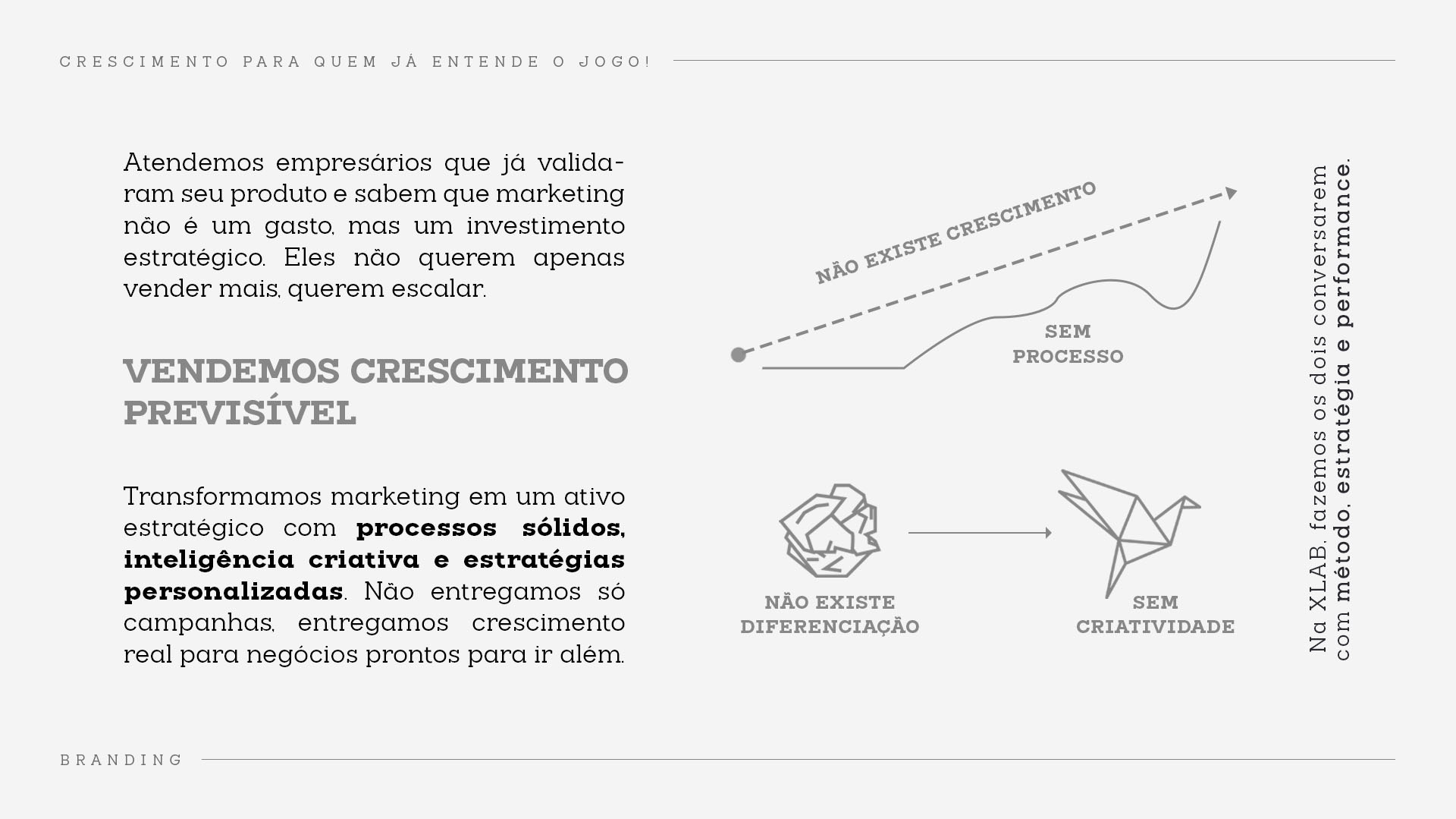
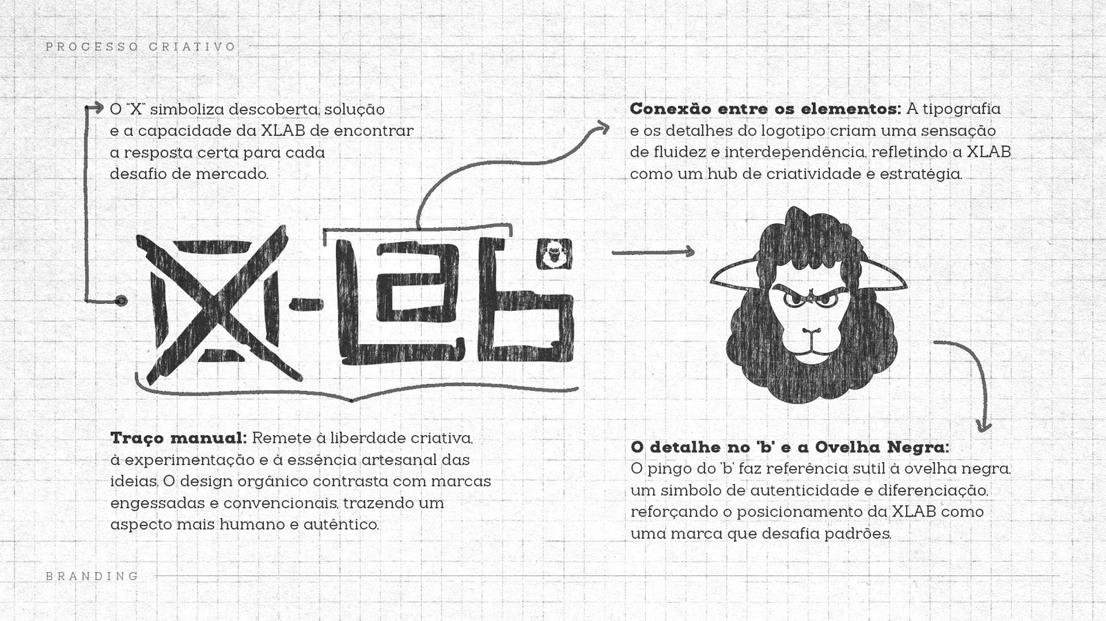
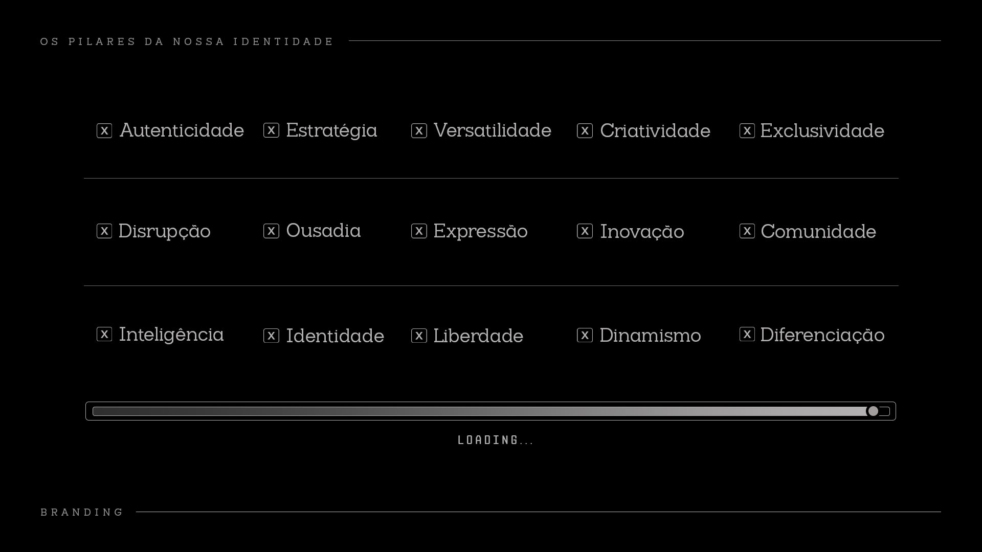
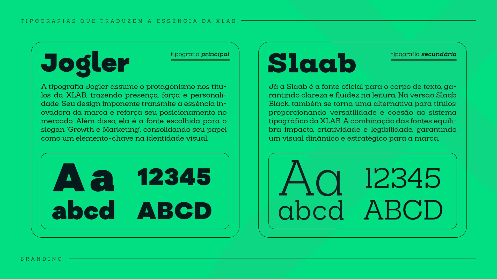
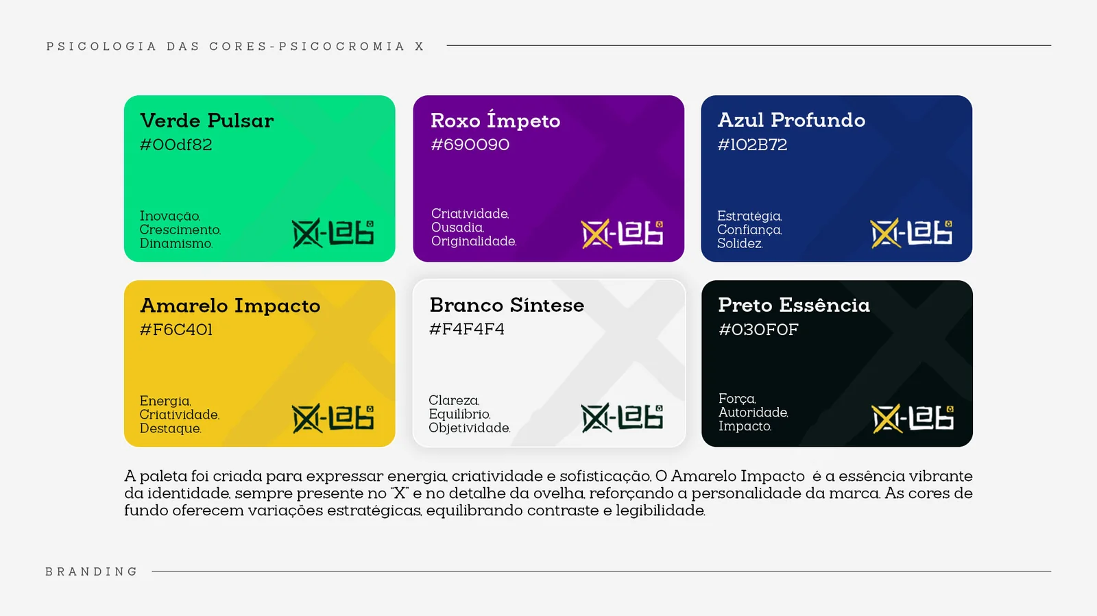
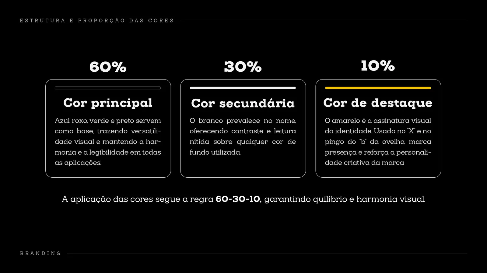
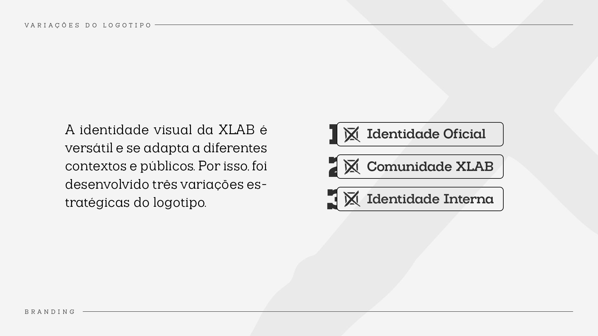
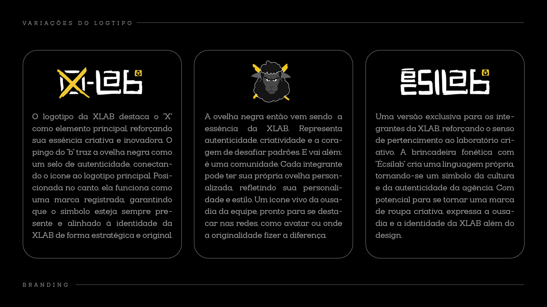
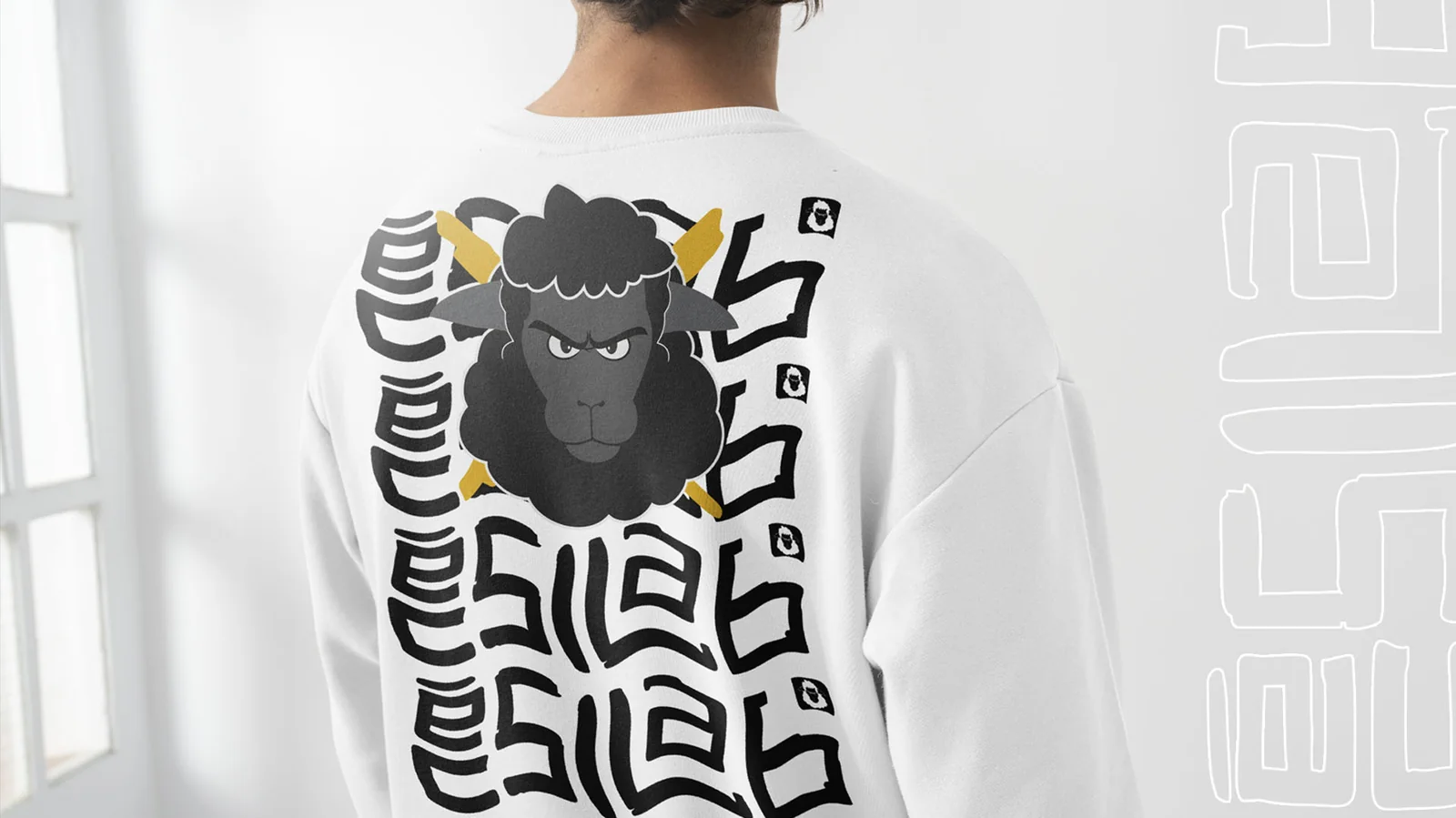
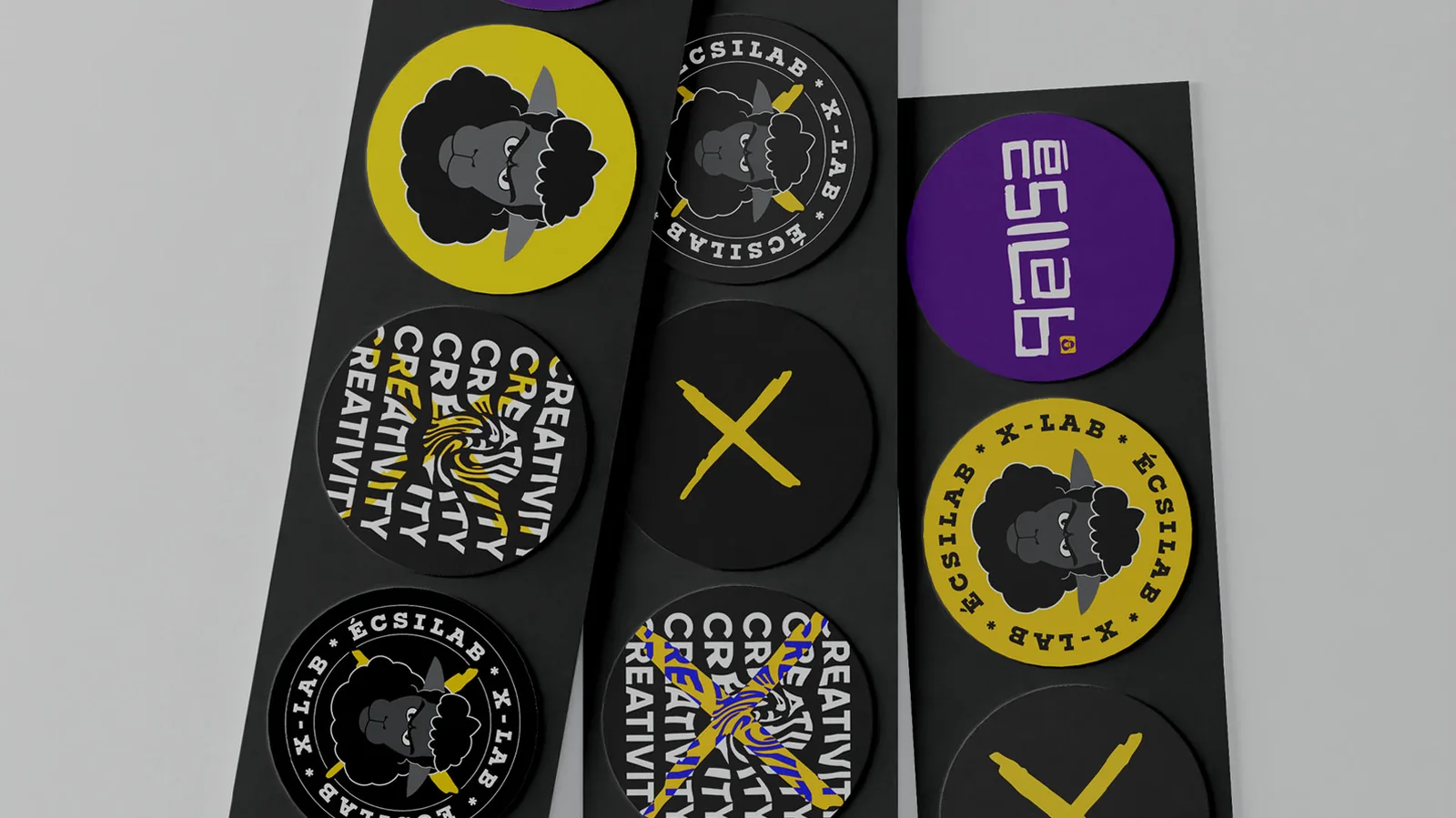
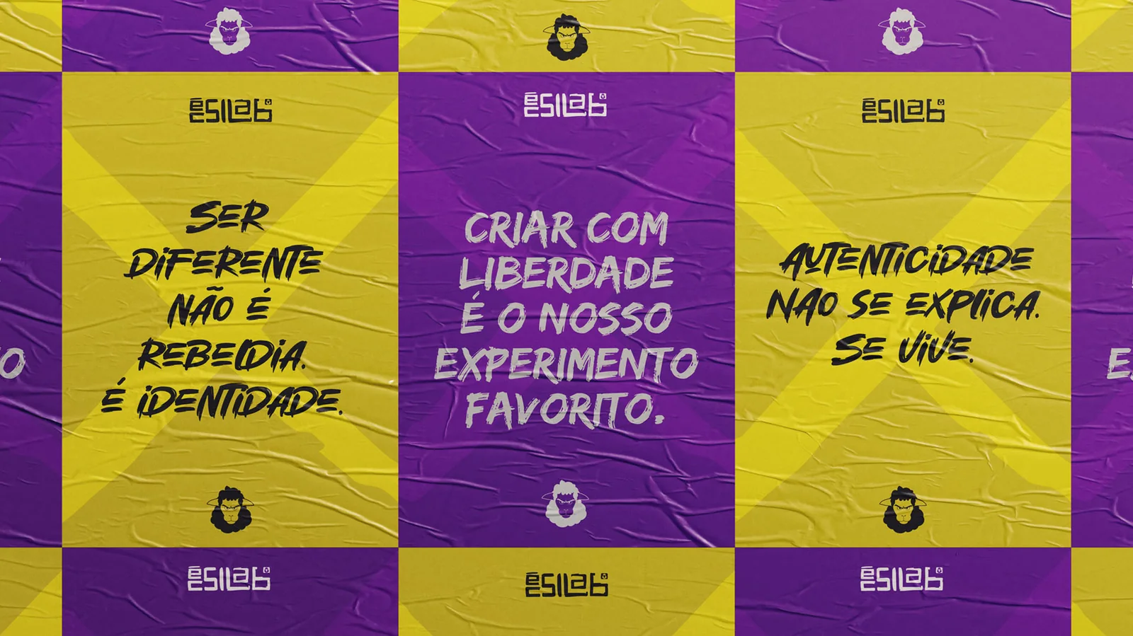
I designed the handover as a system: a type scale, a clear role for each colour, spacing rules and applications shown in real situations.
I gathered everything into an easy-to-use guide, so whoever creates a new piece knows what to use and why.
The brand became easy for others to apply.
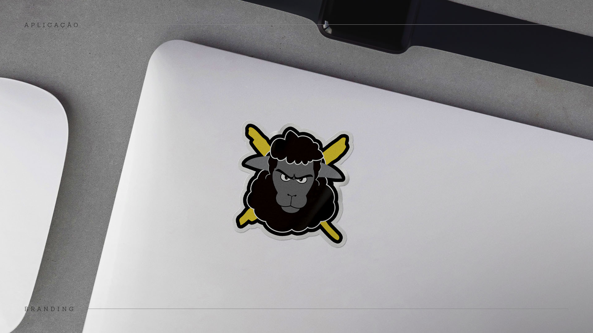
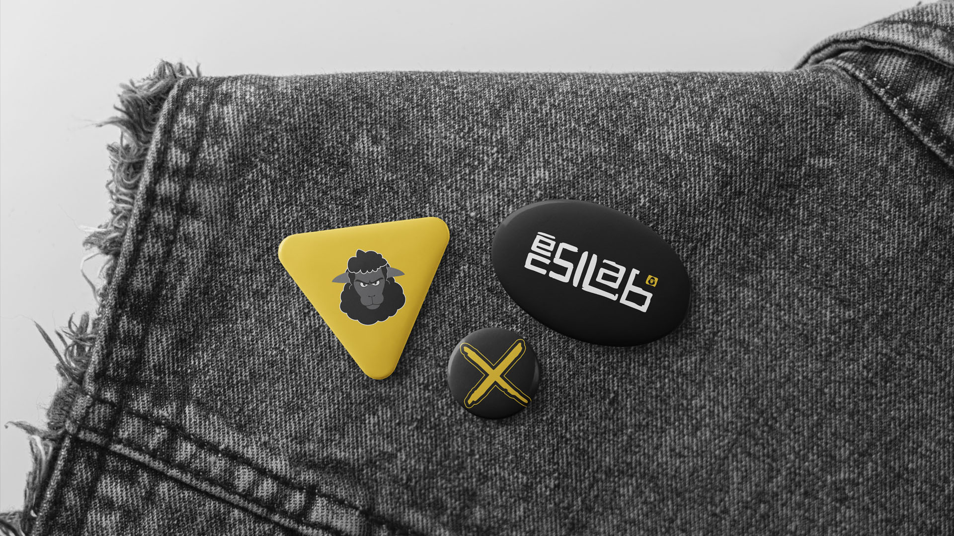
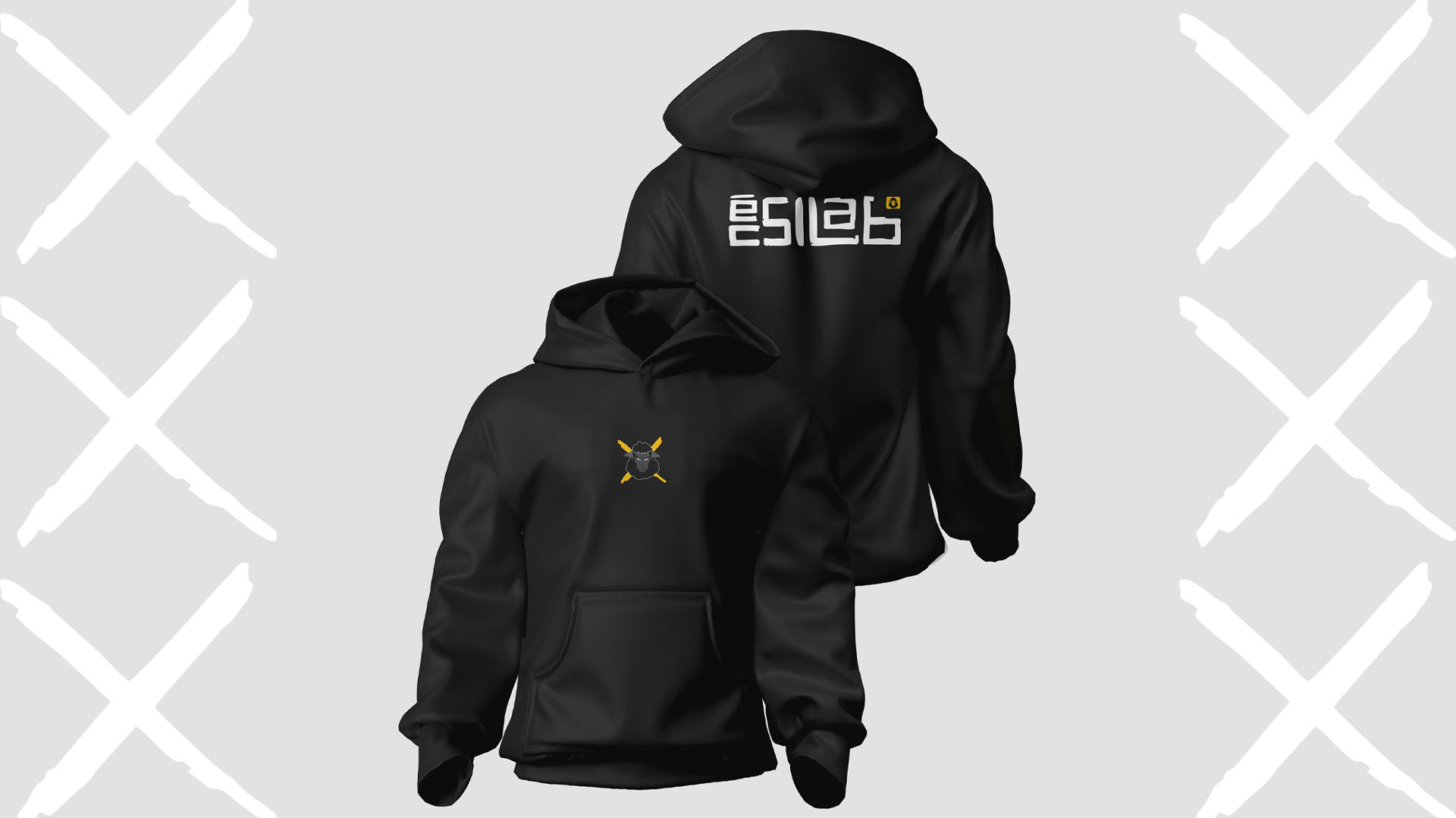
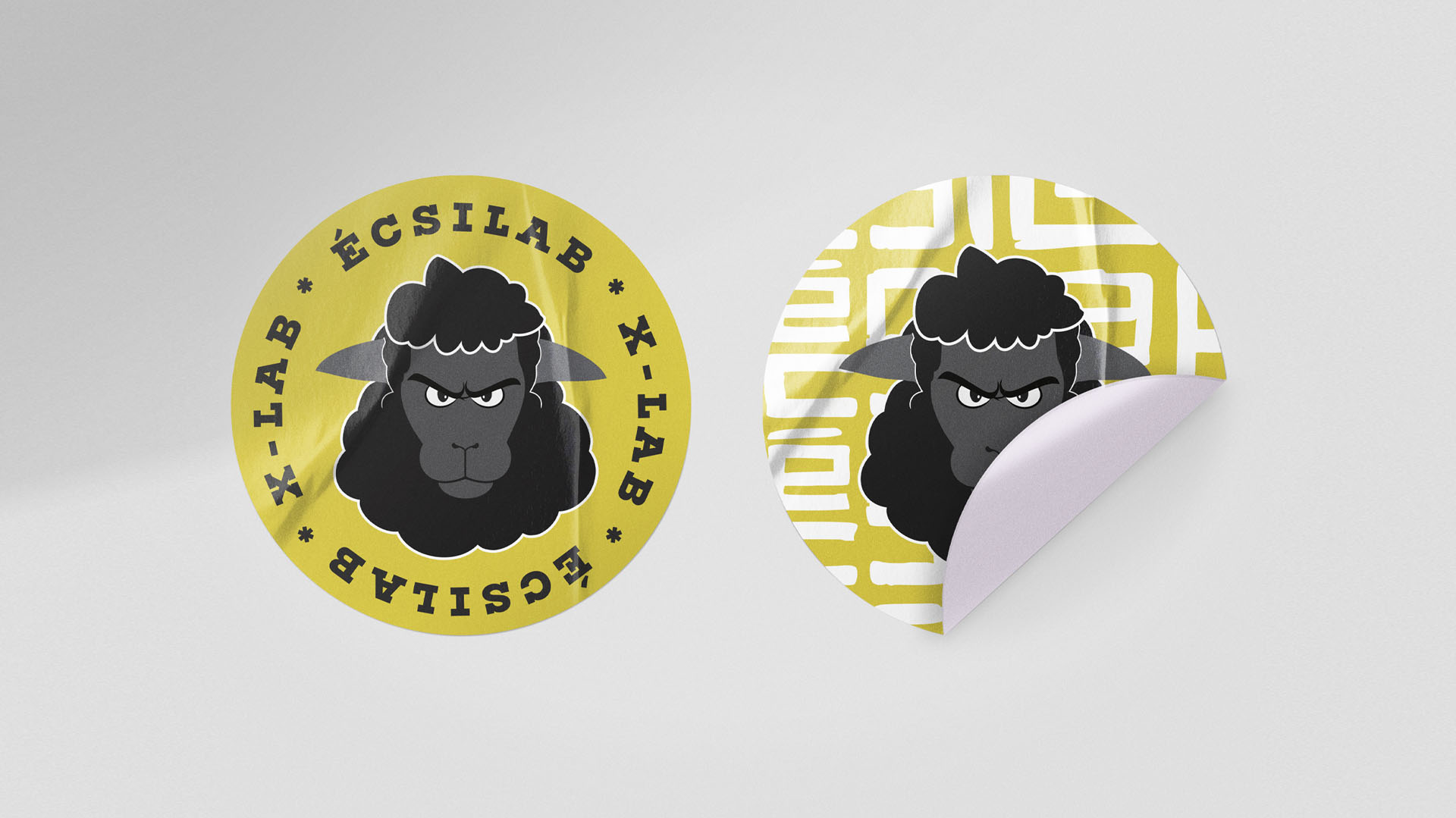
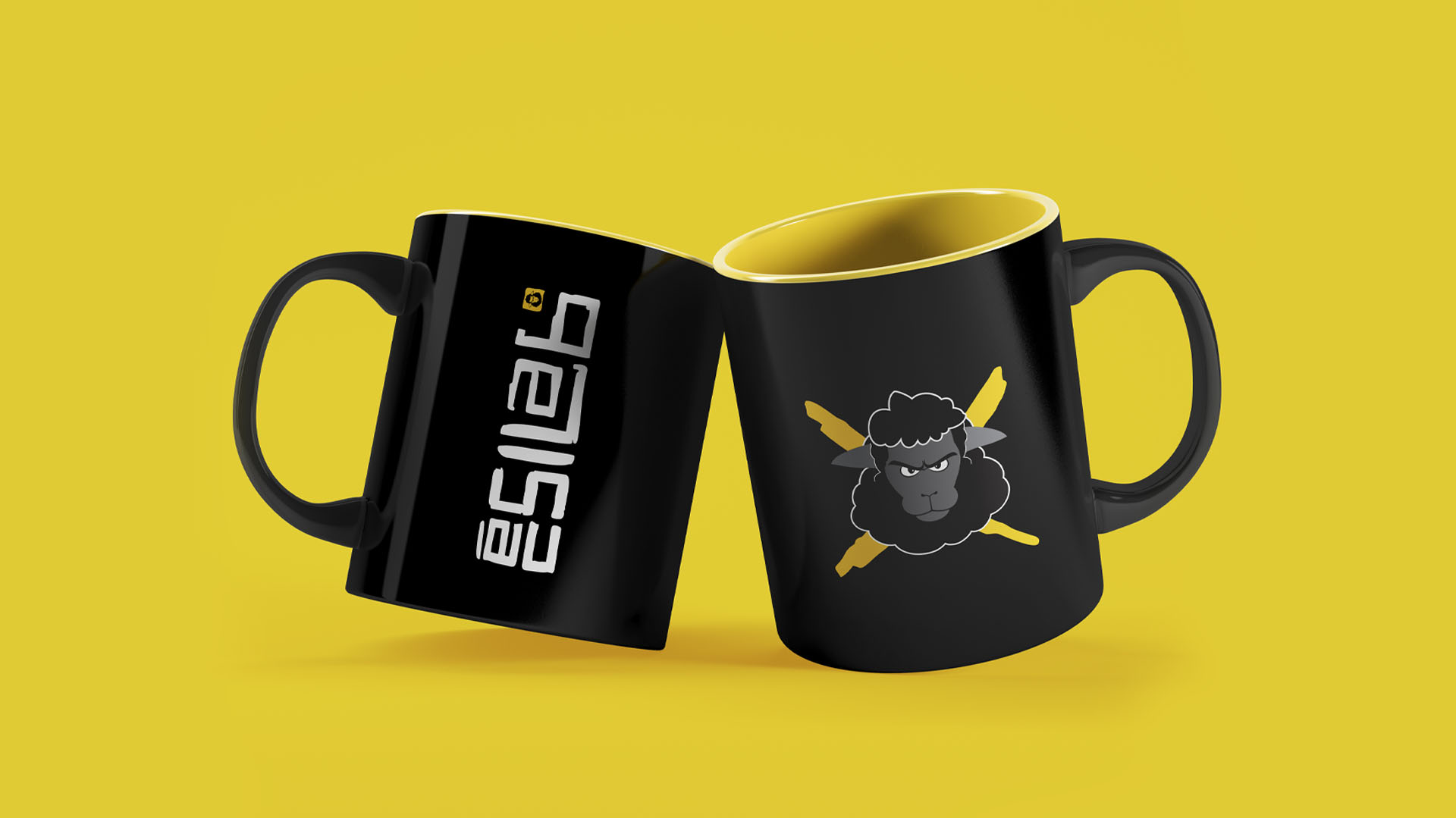
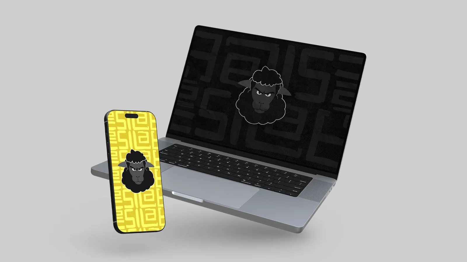
X-Lab received the logo, visual system, typography, colours, digital and print applications and a guide that brings it all together.
With the rules at hand, the team can create new pieces on their own, and the brand stays recognisable everywhere it appears.
Project screens
Want a project like this for your business?
Tell me what's going on in your business. I start by listening, and we'll find the best way forward together.
Let's talkMore projects
Landing page for a neuropsychology practice
A neuropsychological assessment explained in the words families use every day.
Landing page · UI/UXLanding page for an affordable dental clinic
For people who feel nervous about the dentist, the page explains the first visit before asking them to book.
Landing page · UI/UXLanding page for a paediatric cardiologist
For parents worried about their child's heart: plain language and booking always within reach.